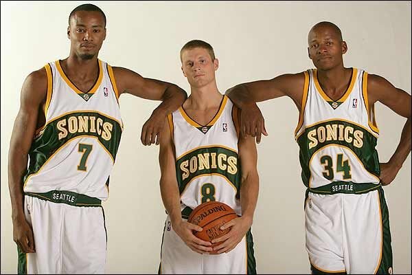
Sonics Jerseys Through the Years
1967-1969
The Sonics entered the NBA in 1967 alongside the San Diego Rockets, at the beginning of a ten-year period of growth and acquisition for the league. The two new franchises were born at the height of the Space Age, and both teams opted for futuristic monikers and nods to the booming aerospace industry.
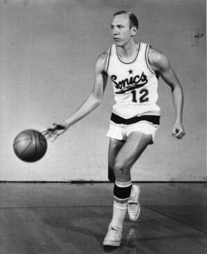
The SuperSonics name, submitted by a school-age boy and selected by original owner Sam Schulman, pays homage to the Boeing 2707, a state-of-the-art supersonic transport designed to fly at Mach 2.7 (2.7 times the speed of sound). As a fresh franchise in a city new to the professional sports scene, the Sonics made a statement with their inaugural jerseys. At the time, NBA jerseys tended towards traditional wordmarks and fonts (think Russell’s Celtics or Wilt’s Philadelphia/San Francisco Warriors). Seattle elected for a more cutting-edge look - the 1967 jerseys have an electric feel to them; featuring big, showy font underlined by a lightning bolt. The primary logo depicted a rocket blasting off over a basketball.
The Sonics’ branding gamble paid off and helped establish the team as one of the league’s signature franchises. The Green and Gold became a uniquely recognizable color combination, not unlike Laker Purple/Gold and Knick Blue/Orange.
1969-1972
After 2 years in the inaugural sets, the Sonics went through their first uniform evolution. The original font was adjusted to a softer script and the rocket graphic was retired after the 1970 season. The uniforms became a bit more conservative – the star was removed and the flashy lightning bolt was replaced with a more restrained underline. It was during the latter half of this period that Seattle first introduced yellow jerseys, temporarily replacing white as the primary home jersey.
1972-1975
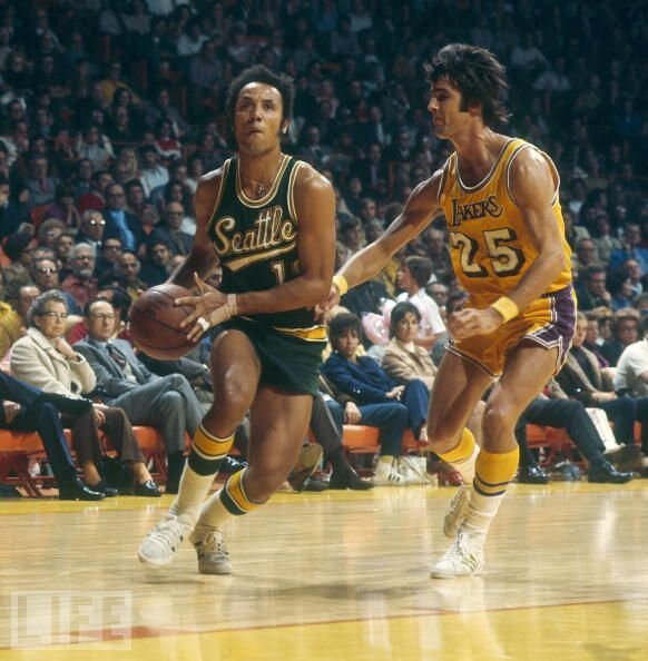
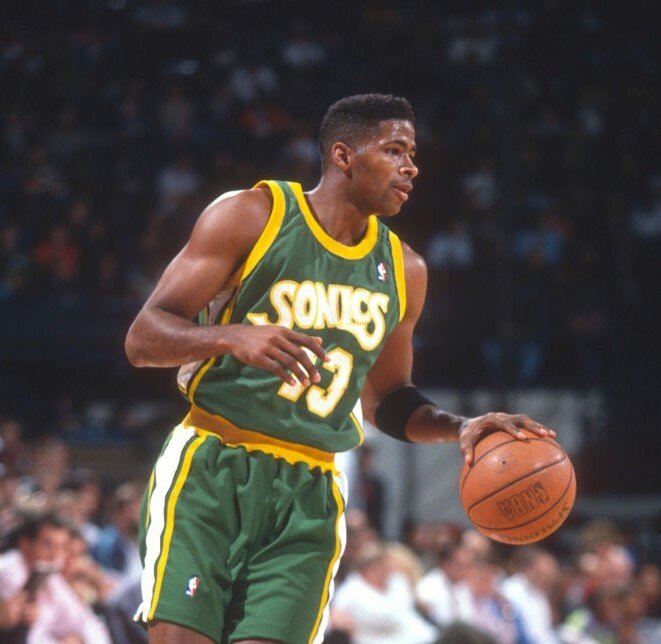
In 1972 the Sonics moved away from their cursive font and adopted a fun, almost cartoon-like wordmark. Yellow remained the default color for the home uniforms; white wouldn’t return until the 1975-’76 season. This generation of jersey would become a popular throwback jersey in the 90’s (Kendall Gill pictured below wearing it in 1995).
1975-1978
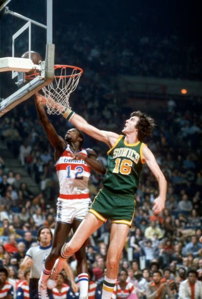
After the 1974-’75 season, the Sonics made yet another update to their jerseys, this time inching closer what would become their most iconic sets. White was reinstalled as the home uniform color (yellow wouldn’t be seen again as a primary color until 2004) and the cartoon-like lettering was replaced with sharp block font.
1978-1995
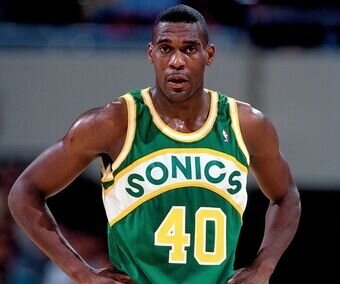
The 1975-1995 skyline logo look was the Sonics’ longest-lasting and probably their most popular. These were the uniforms that carried the Sonics to a championship in 1979 and introduced the world to Payton and Kemp in the late 80’s/early 90’s.
The rebrand was the Sonics’ second in fourth in 8 years, and the designers landed on what is regarded as one of the cleanest looks in NBA history. The “Sonics” wordmark was fitted into curved arch that was stretched across the jersey chest – green arch for the home whites and white arch for the road greens. The effect was a perfect combination of yellow, green, and white.
Ultimately, this generation of jersey is remembered for its iconic Seattle Skyline logo. NBA franchises had long adopted the brand of their cities – this pattern is often reflected in names (Detroit Pistons, Boston Celtics, Philadelphia 76ers, etc.) The Sonics were one of the first teams to apply this theme visually and take imagery from their city and incorporate it as a major component of their uniform. Though out of use for 25 years, the logo looms large in Seattle lore – the best view of our skyline will always be through the panes of that green and gold basketball.
1995-2001
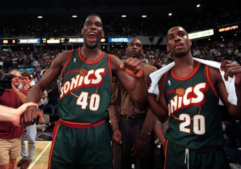
After disappointing playoff exits in 1994 and 1995, the Sonics went through their most extreme rebrand, dropping yellow from their color scheme in favor of a bronzed red (they introduced a red alternate in 1999 as well). The skyline logo was retired in favor of a Space Needle “i” orbited by a basketball. The bold new sets were quintessentially 90’s, a futuristic look for a young, athletic team ready to break through and take the league by storm.
In their first year wearing the new jerseys, the Sonics rolled through the regular season with a franchise record 64 wins before meeting the Bulls in the finals in what is still the strongest finals (by total wins) in NBA history. Seattle ultimately fell to the Bulls in six games, but not before the new jerseys were cemented in history as a memorable part of one of the NBA’s most epic clashes.
2001-2008
Along with their sale in 2001, the Sonics returned to their green and gold roots, putting a 21st-century spin on the arched chest band. The team elected to use a slightly darker shades of yellow and green than had been used in the skyline logo era. The new design featured a yellow alternate, the first time yellow was used as a primary color since the mid-‘70’s.
